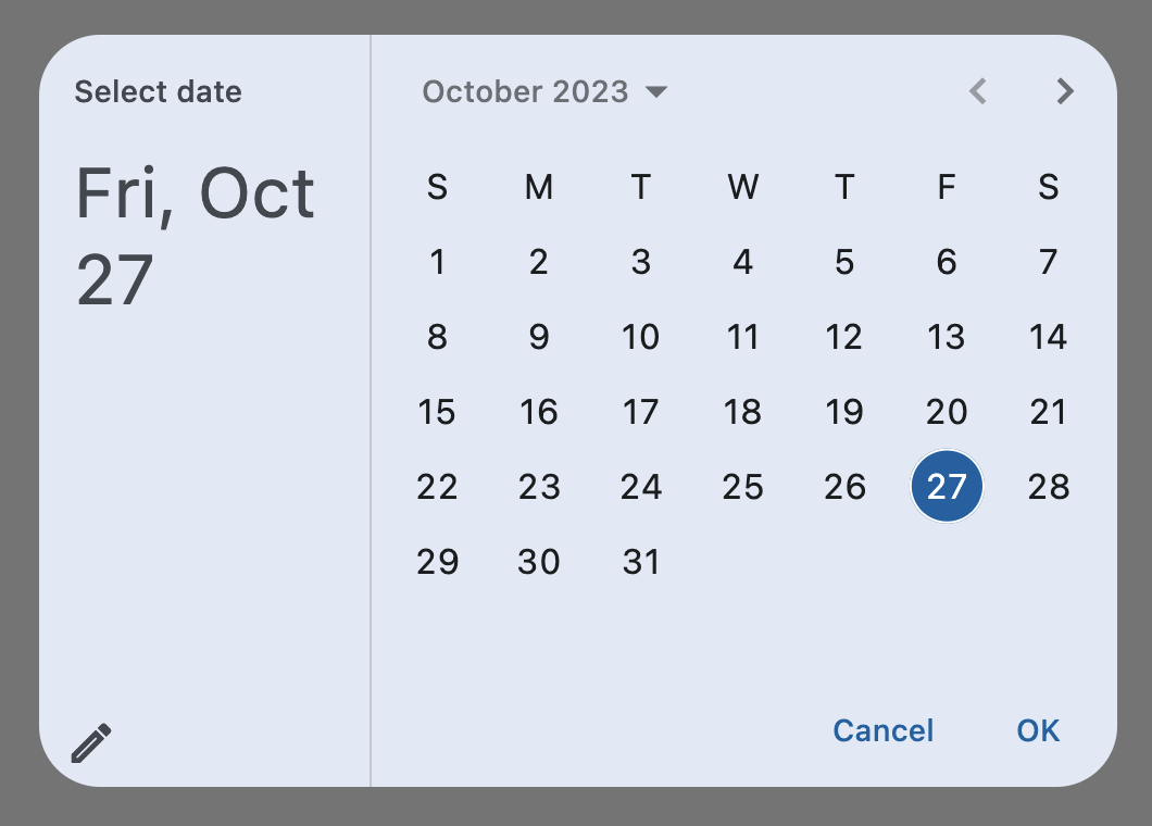
DatePicker
A Material-style date picker dialog.
It can be opened by calling Page.show_dialog() method.
Depending on the entry_mode, it will show either a Calendar
or an Input (TextField) for picking a date.
Inherits: DialogControl
Properties
-
barrier_color(ColorValue | None) –The color of the modal barrier that darkens everything below this picker's dialog.
-
cancel_text(str | None) –The text that is displayed on the cancel button.
-
confirm_text(str | None) –The text that is displayed on the confirm button.
-
current_date(DateTimeValue) –The date representing today. It will be highlighted in the day grid.
-
date_picker_mode(DatePickerMode) –Initial display mode of this picker.
-
entry_mode(DatePickerEntryMode) –The initial mode of date entry method for the date picker dialog.
-
error_format_text(str | None) –The error message displayed below the text field if the entered date is not in the
-
error_invalid_text(str | None) –The error message displayed below the text field if the date is earlier than
-
field_hint_text(str | None) –The hint text displayed in the text field.
-
field_label_text(str | None) –The label text displayed in the
TextField. -
first_date(DateTimeValue) –The earliest allowable date that the user can select.
-
help_text(str | None) –The text that is displayed at the top of the header.
-
inset_padding(PaddingValue) –The amount of padding added to
view_insetsof the -
keyboard_type(KeyboardType) –The type of keyboard to use for editing the text.
-
last_date(DateTimeValue) –The latest allowable date that the user can select.
-
locale(Locale | None) –The locale for this date picker dialog. It is intended for (rare) cases where this
-
modal(bool) –Whether this date picker cannot be dismissed by clicking the area outside of it.
-
switch_to_calendar_icon(IconData | None) –The icon displayed in the corner of this picker's dialog when
-
switch_to_input_icon(IconData | None) –The icon displayed in the corner of this picker's dialog when
-
value(DateTimeValue | None) –The selected date that the picker should display.
Events
-
on_change(ControlEventHandler[DatePicker] | None) –Called when user clicks confirm button.
-
on_entry_mode_change(EventHandler[DatePickerEntryModeChangeEvent] | None) –Called when the
entry_modeis changed from the user interface.
Examples#
Basic Example#
import datetime

import flet as ft


def main(page: ft.Page):
    page.horizontal_alignment = ft.CrossAxisAlignment.CENTER

    def handle_change(e: ft.Event[ft.DatePicker]):
        page.add(ft.Text(f"Date changed: {e.control.value.strftime('%m/%d/%Y')}"))

    def handle_dismissal(e: ft.Event[ft.DialogControl]):
        page.add(ft.Text("DatePicker dismissed"))

    today = datetime.datetime.now()

    d = ft.DatePicker(
        first_date=datetime.datetime(year=today.year - 1, month=1, day=1),
        last_date=datetime.datetime(year=today.year + 1, month=today.month, day=20),
        on_change=handle_change,
        on_dismiss=handle_dismissal,
    )

    page.add(
        ft.Button(
            content="Pick date",
            icon=ft.Icons.CALENDAR_MONTH,
            on_click=lambda e: page.show_dialog(d),
        )
    )


ft.run(main)
Properties#
class-attribute
instance-attribute
#
barrier_color: ColorValue | None = None
The color of the modal barrier that darkens everything below this picker's dialog.
If None, the DialogTheme.barrier_color is used.
If it is also None, then Colors.BLACK_54 is used.
class-attribute
instance-attribute
#
cancel_text: str | None = None
The text that is displayed on the cancel button.
Defaults to "Cancel".
class-attribute
instance-attribute
#
confirm_text: str | None = None
The text that is displayed on the confirm button.
Defaults to "OK".
class-attribute
instance-attribute
#
current_date: DateTimeValue = field(
    default_factory=lambda: now()
)
The date representing today. It will be highlighted in the day grid.
class-attribute
instance-attribute
#
date_picker_mode: DatePickerMode = DAY
Initial display mode of this picker.
class-attribute
instance-attribute
#
entry_mode: DatePickerEntryMode = CALENDAR
The initial mode of date entry method for the date picker dialog.
class-attribute
instance-attribute
#
error_format_text: str | None = None
The error message displayed below the text field if the entered date is not in the correct format.
Defaults to "Invalid format".
class-attribute
instance-attribute
#
error_invalid_text: str | None = None
The error message displayed below the text field if the date is earlier than
first_date or later than last_date.
Defaults to "Out of range".
class-attribute
instance-attribute
#
field_hint_text: str | None = None
The hint text displayed in the text field.
The default value is the date format string that depends on your locale.
For example, 'mm/dd/yyyy' for en_US.
class-attribute
instance-attribute
#
field_label_text: str | None = None
The label text displayed in the TextField.
If None, defaults to the words representing the date format string.
For example, 'Month, Day, Year' for en_US.
Defaults to "Enter Date".
class-attribute
instance-attribute
#
first_date: DateTimeValue = field(
    default_factory=lambda: datetime(
        year=1900, month=1, day=1
    )
)
The earliest allowable date that the user can select.
Defaults to January 1, 1900.
class-attribute
instance-attribute
#
help_text: str | None = None
The text that is displayed at the top of the header.
This is used to indicate to the user what they are selecting a date for.
Defaults to "Select date".
class-attribute
instance-attribute
#
inset_padding: PaddingValue = field(
    default_factory=lambda: symmetric(
        horizontal=16.0, vertical=24.0
    )
)
The amount of padding added to view_insets of the
Page.media on the outside of this picker's dialog.
This defines the minimum space between the screen's edges and the dialog.
class-attribute
instance-attribute
#
keyboard_type: KeyboardType = DATETIME
The type of keyboard to use for editing the text.
class-attribute
instance-attribute
#
last_date: DateTimeValue = field(
    default_factory=lambda: datetime(
        year=2050, month=1, day=1
    )
)
The latest allowable date that the user can select.
Defaults to January 1, 2050.
class-attribute
instance-attribute
#
locale: Locale | None = None
The locale for this date picker dialog. It is intended for (rare) cases where this dialog should be localized differently from the rest of the page.
It overrides the locale used by the page (see Page.locale_configuration),
but does not participate in page-level locale resolution.
If set to None (the default) or an inexistent/unsupported locale,
the current_locale of the
Page.locale_configuration is used as fallback.
class-attribute
instance-attribute
#
modal: bool = False
Whether this date picker cannot be dismissed by clicking the area outside of it.
class-attribute
instance-attribute
#
switch_to_calendar_icon: IconData | None = None
The icon displayed in the corner of this picker's dialog when
entry_mode is DatePickerEntryMode.INPUT.
Clicking on this icon changes the entry_mode to
DatePickerEntryMode.CALENDAR.
If None, defaults to Icons.CALENDAR_TODAY.
class-attribute
instance-attribute
#
switch_to_input_icon: IconData | None = None
The icon displayed in the corner of this picker's dialog when
entry_mode is DatePickerEntryMode.CALENDAR.
Clicking on icon changes the entry_mode to
DatePickerEntryMode.INPUT.
If None, defaults to Icons.EDIT_OUTLINED.
class-attribute
instance-attribute
#
value: DateTimeValue | None = None
The selected date that the picker should display.
Defaults to current_date.
Events#
class-attribute
instance-attribute
#
on_change: ControlEventHandler[DatePicker] | None = None
class-attribute
instance-attribute
#
on_entry_mode_change: (
    EventHandler[DatePickerEntryModeChangeEvent] | None
) = None
Called when the entry_mode is changed from the user interface.